cssMedia Queries
This page covers the core concepts that will allow you to create responsive web sites – that is, web sites that look good on all devices, regardless of size or form factor.
Understanding viewports
The viewport is the area within a web browser that is being viewed. Currently, as you’re looking at this very page, the area that the site content takes up – the bits of this actual site, not the browser’s address bar, toolbars, menu bar, etc – is the viewport.
Even if your laptop or computer screen is huge, if you’ve set your browser to only take up a fraction of that display, the viewport is the space the browser’s content actually uses – not the space available to it. So, if you have a 17" laptop that is roughly 1920 pixels wide, but your browser is only taking up 50% of the width of the screen, the viewport is less than 960 pixels.
If you look back at your previous project’s HTML, you’ll note that you’ve already been writing code targeting viewports; you should see a meta element in your HTML head that looks like this:
<meta content="width=device-width, initial-scale=1.0" name="viewport">
This code tells the browser to use the width of the browser or device as the viewport width (compared to some other specific number or a default value) and to set the page’s initial zoom level to be 100% (neither zoomed in nor zoomed out).
Understanding what a viewport is and how it impacts your layout is key to responsive web design.
What is responsive design?
A web page is considered responsive when its content adjusts to a variety of viewport sizes.
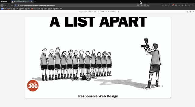
This term was introduced in 2010 by Ethan Marcotte, and the header illustration for his article is still a fun example of what it means to be responsive:
It’s important to note here that HTML, with no CSS applied, is already responsive. You may remember this example from the reading on Browser Defaults ✳️ – 99% of the elements on that page just work, with no additional CSS, regardless of the size of your browser or device.
Of course, we are going to add CSS to our HTML, modifying the defaults in all sorts of ways. And, since HTML with no CSS is responsive, we owe it to our users to make the CSS we write also responsive.
Put another way: The styles you write shouldn’t make things worse than they were before you added CSS.
Responsive CSS
Since responsive demos require being able to adjust the viewport width directly, the examples that follow will not be embedded in the page; instead, be on the lookout for links to Glitch projects that demonstrate the following CSS. Glitch demos are identified by 🐠 symbol.
To create responsive designs, you will need to write media queries inside of your CSS. Media queries are a way of targeting specific viewport sizes.
If, for example, you wanted the background color of your site to be different for anyone with a viewport 800 pixels or larger, you could write the following CSS:
@media (min-width: 800px) {
  body {
    background-color: gold;
  }
}
🐠 See an example on Glitch 🐠
@mediaidentifies that your code is a media query; all of your media queries will begin this way.- The content inside the parentheses
()is a rule; this rule must be matched by the viewport conditions in order for the CSS inside the media query to be applied min-widthmeans the viewport must be at least this large and requires a value (in this case, 800 pixels) to match against- everything inside the curly brackets
{}is standard CSS: at least one selector, followed by another set of curly brackets, and one or more CSS declarations
🤔 This is worth repeating: The only thing that’s new here is the media query. Everything that happens inside your media query is standard CSS, just like you’ve been writing.
If you went back to your last project and put the media query above around all the CSS you wrote, it would mean your HTML would have no styling at any viewport size up to and including 799 pixels and then, 💥 whammo! 💥 at 800 pixels, your styles would be applied.
You can also write a media query that is the reverse of the above example; you can target viewports that are less than 800 pixels by using max-width instead of min-width:
@media (max-width: 799px) {
  body {
    background-color: silver;
  }
}
🐠 See an example on Glitch 🐠
In this example, the background color would be silver for any viewport smaller than 800 pixels.
These targeted values where your site’s styles change based on the viewport are known as breakpoints. So, for both of the examples above, the layout would be said to have a breakpoint of 800 pixels.
You may include multiple breakpoints in your stylesheet.
In addition to height and width, you can also target viewports more generically by orientation.
@media (orientation: landscape) {
  body {
    background-color: gold;
  }
}
@media (orientation: portrait) {
  body {
    background-color: silver;
  }
}
🐠 See an example on Glitch 🐠
In this example, when the browser is wider than it is tall (landscape mode), the background will be gold, and otherwise it will be silver.
Best practices when writing media queries
- Start with no media queries. Establish the smallest viewport you’re coding for (in your responsive projects, I will tell you this info), set your browser to that size and write CSS normally without media queries. This is called writing mobile-first styles as your stylesheet treats the smallest viewport size as the default.
- After you have written your mobile styles (again, without media queries), begin to expand your viewport. At some point, things will look not great: There will be too much whitespace, text lines will be too long, images too huge, something. This is your first media query.
- Do not look to set breakpoints by specific devices. This is, in fact, the opposite of what I just suggested you do. At one point in the history of mobile devices, there were few enough types that people wrote break points specifically for the first and second generation of iPhones, for the first iPad, etc. We are so beyond those times that it’s comical.
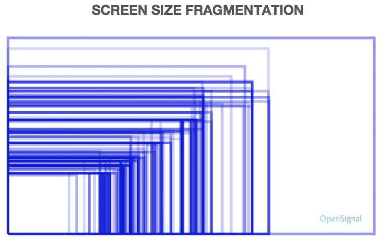
This image (originally from an Open Signal report) shows the variety of screen sizes of Android devices…and it’s from 2015. Design for the content you’re working with, not for a specific device.
- Media queries are not just for changing layout. You can also use them to adjust spacing, font sizes, etc.
Example
The following demo shows how to write mobile-first styles, followed by three media queries to achieve a very basic photo gallery layout.
Click the Remix button to make your own changes to this CSS.
Additional reading ✳️
The following links are entirely optional but provide more context, examples and opportunities to write media queries, if any of those things would be helpful to you.
- Using Media Queries For Responsive Design In 2018 – Even though this article by Rachel Andrew is a few years old, it’s still a great read and a thorough look into how to create responsive designs.
- Beginner’s guide to media queries – This tutorial includes more details about breakpoints and an active learning exercise where you add media queries to some existing HTML.